For this project, I was asked to create an original company and develop a full branding system for it, including a logo, typography, color palette, packaging, and complementary visuals. I decided to design a bubblegum brand called POP, inspired by the playful and nostalgic energy of classic candy but updated with a modern and eco-conscious twist. The mandate required me to explore every part of a brand identity and present a complete, functional system.
Before beginning the design work, I researched existing gum brands, focusing on what made each identity stand out. I studied brands like Hubba Bubba, Trident, and Extra, paying attention to their color choices, logo shapes, and tone of voice. I also looked at current trends in youthful branding, such as rounded typography, soft gradients, and bubbly illustrations. This research helped me understand the visual language of the gum industry and identify an opportunity to create something that felt fun but still clean and contemporary.
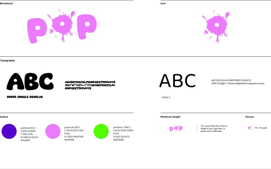
The main design choice for the POP logo was to emphasize the idea of bursting gum. I created a custom wordmark with rounded letters and an exaggerated bubble splat replacing the “O,” which gives the brand a playful personality. This “splat” motif also became the standalone icon. For typography, I paired Super Bubble Regular for headlines because of its whimsical, inflated look with Baloo 2, a friendly and easy-to-read typeface used for body text. This pairing kept the brand lively but still practical.
The color palette combines bright, candy-inspired tones like Pantone 512 C (a vibrant purple), Pantone 203 C (a bubblegum pink), and Pantone 7742 C (a fresh green). These colors were chosen because they communicate sweetness, energy, and freshness, three qualities strongly associated with gum.
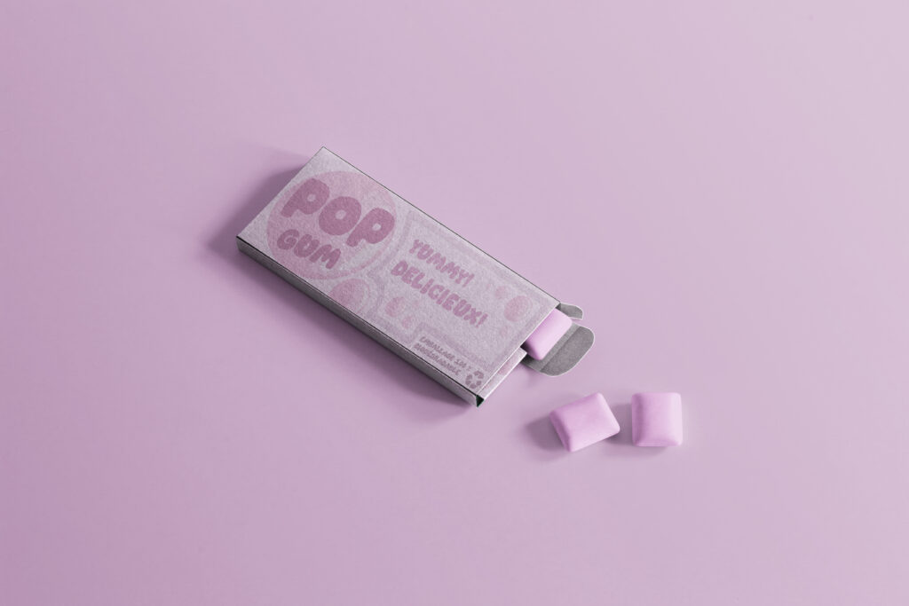
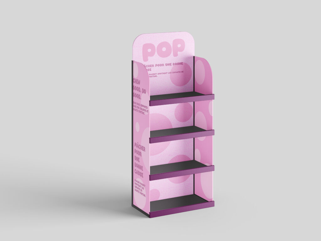
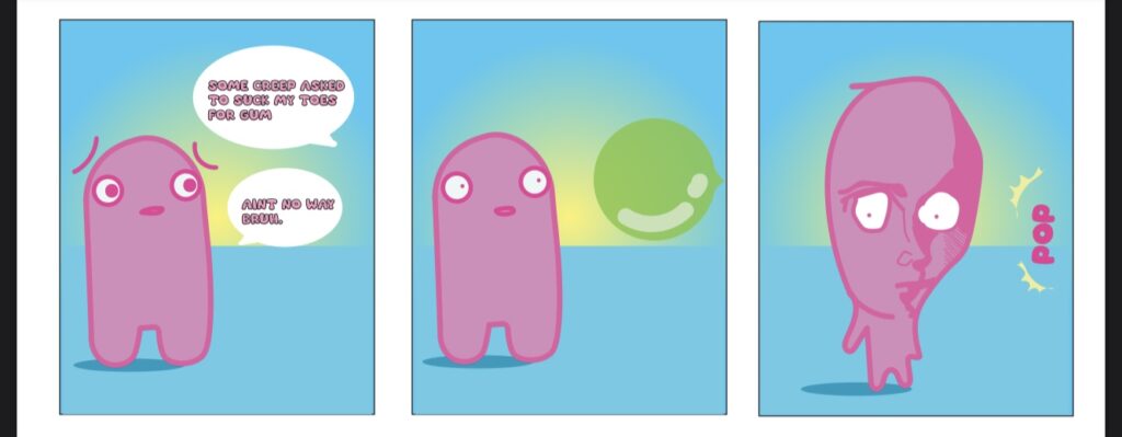
Overall, the POP branding system is designed to feel joyful, youthful, and instantly recognizable, while remaining consistent across logo usage, typography, colors, and applications such as packaging and animation.